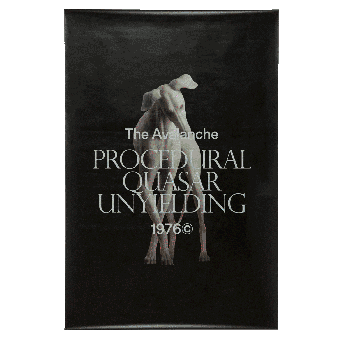
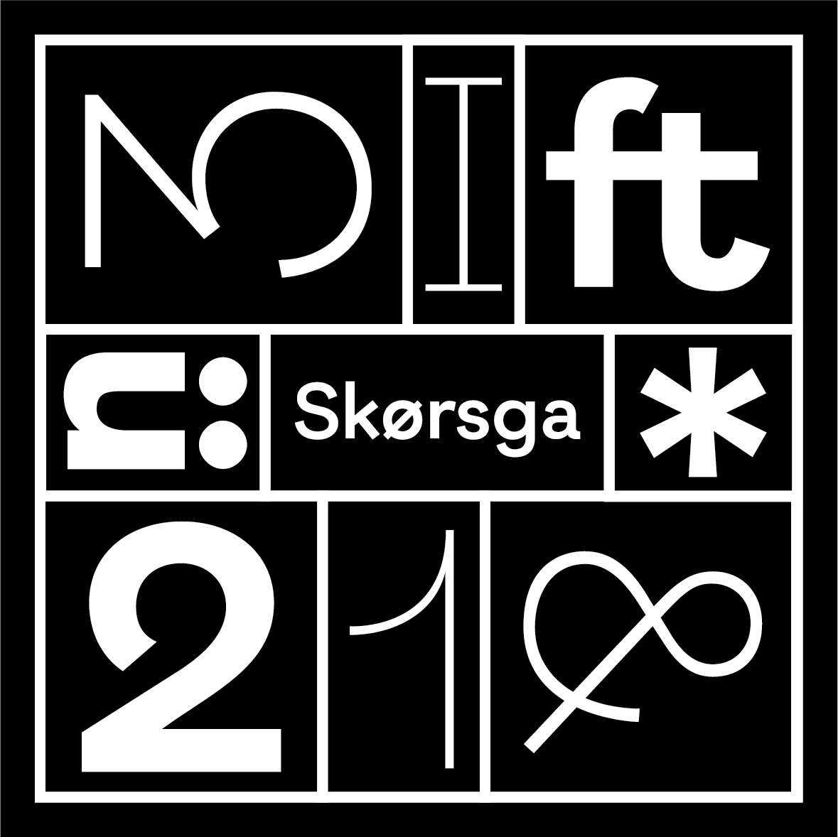
Skørsga

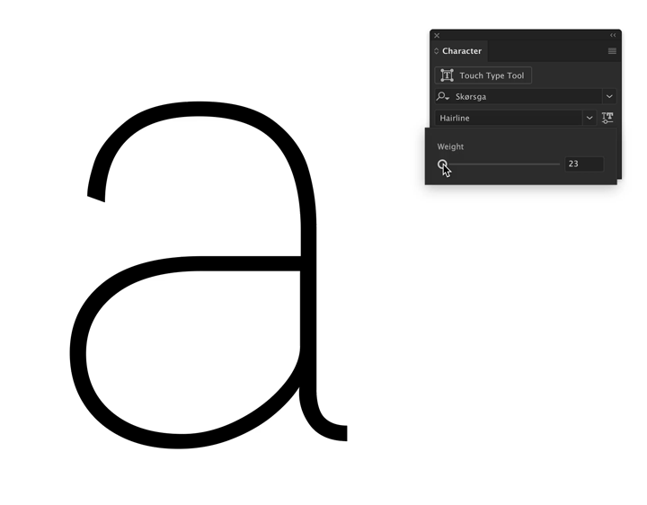
I took on an independent study in type design with Richard Lipton I went about creating a somewhat whimsical sans-serif to further my knowledge in type design. I attempted to create three weights — Hairline, Regular, Black. I went a step further and managed to interpolate weights in between to create a total of seven weights in the family.
I wanted to do more and with the onset of new type technology like variabale fonts, I decided to turn mine into one. This process was a lot more involved as it required each gyph to be constructed with the same anchors and handles along with consistent path directions.
Copyright © 2024 Ishaan Bose Verma. All rights reserved.